It has been almost 6 months since I last posted, due to working on a house renovation. However, I have still been thinking about/working on stuff, particularly on analysis of open position ratios. I had tried using this data as features for machine learning, but my thinking has evolved somewhat and I have reduced my ambition/expectation for this type of data.
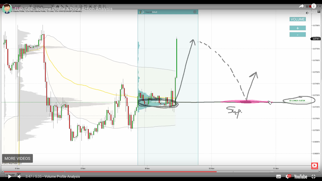
Before I get into this I’d like to mention Trader Dale (I have no affiliation with him) as I have recently been following his volume profile set-ups, a screenshot of one being shown below.
This shows recent Wednesday action in the EUR_GBP pair on a 30 minute chart. The flexible volume profile set-up Trader Dale describes is called a Volume Accumulation Set-up which occurs immediately prior to a big break (in this case up). The whole premise of this particular set-up is that the volume accumulation area will be future support, off of which price will bounce, as shown by the “hand drawn” lines. Below is shown my version of the above chart
with a bit of extra price action included. The horizontal yellow lines show the support area.
Now here is the same data, but in what I’m calling a PositionBook chart, which uses Oanda’s Position Level data downloaded via their API.
The blue (red) horizontal lines show the levels at which traders are net long (short) in terms of positions actually entered/held. The brighter the colours the greater the difference between the longs/shorts. It is obvious that the volume accumulation set-up area is showing a net accumulation of long positions and this is an indication of the direction of the anticipated breakout long before it happens. The Trader Dale set-up presumes an accumulation of longs because of the resultant breakout direction and doesn’t seem to provide an opportunity to participate in the breakout itself!
The next chart shows the action of the following day and a bit where the price does indeed come back down to the “support” area but doesn’t result in an immediate bounce off the support level. The following order level chart perhaps shows why there was no bounce – the relative absence of open orders at that level.
The equivalent PositionBook chart, including a bit more price action,
shows that after price fails to bounce off the support level it does recover back into it and then even more long positions are accumulated (the darker blue shade) at the support level during the London open, again allowing one to position oneself for the ensuing rise during the London morning session, followed by another long accumulation during the New York opening session for a following leg up into the London close (the last vertical red line).
This purpose of this post is not to criticise the Trader Dale set-up but rather to highlight the potential value-add of these new PositionBook charts. They seem to hold promise for indicating price direction and I intend to continue investigating/improving them in the coming weeks.
More in due course.


